


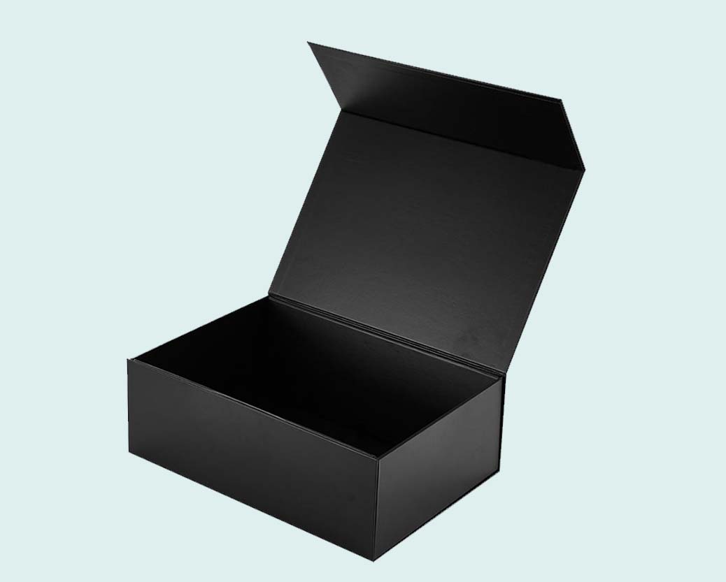

| Box Style | As Mention Above |
|---|---|
| Dimension (L + W + H) | All Custom Sizes & Shapes |
| Minimum Run ( For Boxes and Mylar Bags) | 100 Boxes - 1000 Mylar Bags ( 500 each design) |
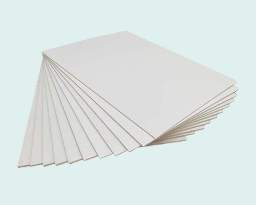
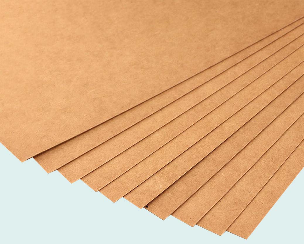
| Paper Stock | 10pt to 28pt (60lb to 400lb) Eco-Friendly Kraft, E-flute Corrugated, Bux Board, Cardstock |
| Printing | No Printing, CMYK, CMYK + 1 PMS color, CMYK + 2 PMS colors |
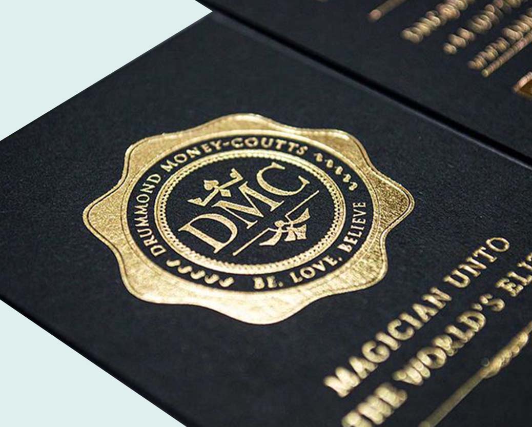
| Finishing | Gloss Lamination, Matte Lamination, Gloss AQ, Gloss UV, Matte UV, Spot UV, Embossing, Foiling |
| Included Options | Die Cutting, Gluing, Scored,Perforation |
| Additional Options | Eco-Friendly, Recycled Boxes, Biodegradable |
| Proof | Flat View, 3D Mock-up, Physical Sampling (On request) |
| Turnaround | 7 - 8 Business Days |
| Shipping | FLAT Position |
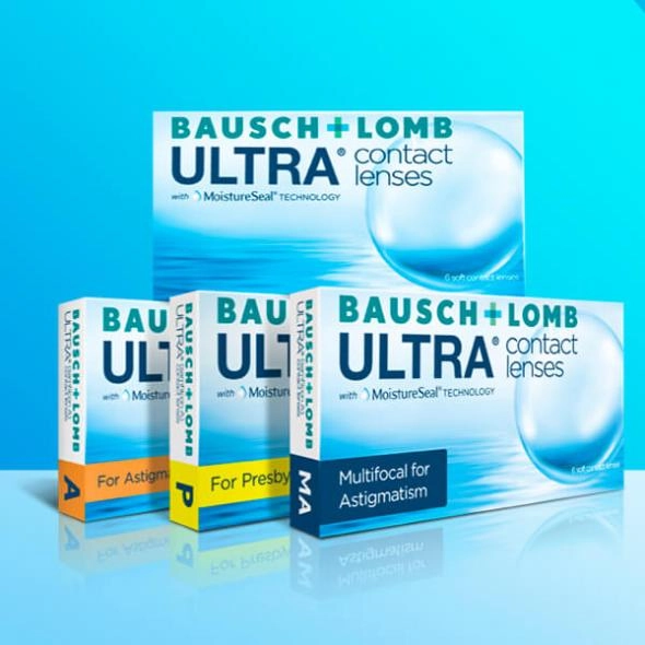
Contact Lens Boxes
Do you want to draw attention to your contact lens on the shelf? One of the best strategies for drawing customers and setting your goods apart from rivals is color. You can make a colorful display for your Contact Lens Boxes to draw customers and increase sales. We'll go over the ideal color schemes for Contact Lens Boxes in this article, along with some tips on how to make the most of them.
Understanding the Importance of Color in Packaging Design
Colour is essential for capturing the attention of potential customers and creating a positive first impression in the packaging design field. It is impossible to exaggerate the value of colour in packaging design. It may arouse feelings, convey ideas, and differentiate items from rivals. This is especially true for contact lens boxes, where a thoughtful colour scheme can increase sales by drawing in clients.
The power of colour to arouse emotions and establish a connection with customers is only one of the main reasons it is so crucial in packaging design. Various colours have various psychological connotations. As an illustration, the colours blue and red are frequently linked to dependability and vigor. You may take advantage of these psychological associations and establish a strong emotional connection with your target audience by carefully choosing the colours for the contact lens packaging.
Additionally, color plays a significant role in conveying messages and communicating brand values. By aligning the color palette of your contact lens boxes with your brand identity, you can reinforce your brand image and build brand recognition. Consistency in color usage across different marketing materials can help create a cohesive and memorable brand experience for consumers.
Key Considerations for Selecting Colors for Contact Lens Boxes
When selecting colors for your contact lens boxes, several key considerations must be remembered. These factors will help you create a visually appealing and impactful design to attract customers and make your product stand out on the shelf.
Think about the overall image you want to convey. Do you want to come across as modern and innovative? Then, consider using sleek and contemporary color combinations like black, silver, white, and metallic. To appear more natural and organic, earthy tones like greens, browns, or blues might better fit.
By considering your target audience, your brand image, and the practicality of your color choices, you can select the perfect color combinations for your contact lens boxes. These considerations will make your packaging visually appealing and effectively communicate your brand identity and connect with your customers on an emotional level.
Color Combination Ideas for Different Target Audiences (e.g. age, gender, lifestyle)
Consider using bold and bright color combinations for a younger and more vibrant audience. Colors like red, yellow, and orange are energetic and attention-grabbing, perfect for catching the eye of a younger demographic. These vibrant hues can create a sense of excitement and playfulness, appealing to a youthful and energetic lifestyle.
On the other hand, if your target audience is more sophisticated and mature, opt for softer and more muted color combinations. Blues, grays, and neutrals convey a sense of calmness and professionalism. These colors can evoke a feeling of trust and reliability, perfect for establishing credibility and appealing to a more mature demographic.
Overall, understanding the preferences and lifestyle of your target audience is key when selecting color combinations for your contact lens. By choosing colors that resonate with your customers and evoke the desired emotions, you can create packaging that truly stands out and captures the attention of your target market.
The Impact of Color on Brand Recognition and Loyalty
Color is closely tied to our emotions and can evoke specific feelings and associations. When customers consistently see your brand's colors, they develop a subconscious connection between those colors and your brand's identity. This association creates brand recognition and loyalty as customers become familiar with and trust your brand.
Take, for example, the iconic blue color used by social media giant Facebook. The consistent use of this color across their platform has led to instant brand recognition. When customers see that shade of blue, they immediately associate it with Facebook, regardless of whether the logo is present. This is the power of color in building brand recognition.
In addition to recognition, color influences customer perceptions of your brand's values and personality. For example, bright and bold colors can create a sense of energy and playfulness, while softer and muted tones can convey professionalism and sophistication. By choosing colors that align with your brand's image, you can shape how customers perceive your brand and build a strong emotional connection.
To effectively incorporate brand colors, consistency is key. Use your brand's colors across all touchpoints, from your website to your social media platforms and, of course, your packaging. This consistency reinforces your brand's identity and helps customers associate those colors with your brand.
Tips for Incorporating Brand Colors Effectively
Be consistent: Consistency is key when incorporating your brand colors. Use the same color palette across all your marketing materials, from your website to your social media platforms and, of course, on your contact lens boxes. This consistency reinforces your brand's identity and helps customers associate those colors with your brand.
Use color psychology: Remember the psychological associations that different colors have. Use this knowledge to your advantage by selecting colors that align with your brand's values and desired emotional response. For example, if you want to convey a sense of energy and excitement, opt for bold and vibrant colors. If you want to communicate professionalism and reliability, choose softer and more muted tones.
Consider contrast: While consistency is important, you can still play with contrast to create visual interest. Consider using complementary or contrasting colors to make certain elements, such as your brand logo or product name, stand out. This can add depth and dimension to your contact lens boxes.
Jacky Chan
Since 2012
Thank you very fast shipping from Poland only 3days.
December 4, 2020 at 3:12 pm
ReplyAna Rosie
Since 2008
Great low price and works well.
December 4, 2020 at 3:12 pm
ReplySteven Keny
Since 2010
Authentic and Beautiful, Love these way more than ever expected They are Great earphones
December 4, 2020 at 3:12 pm
Reply