


| Box Style | As Mention Above |
|---|---|
| Dimension (L + W + H) | All Custom Sizes & Shapes |
| Minimum Run ( For Boxes and Mylar Bags) | 100 Boxes - 1000 Mylar Bags ( 500 each design) |
| Paper Stock | 10pt to 28pt (60lb to 400lb) Eco-Friendly Kraft, E-flute Corrugated, Bux Board, Cardstock |
| Printing | No Printing, CMYK, CMYK + 1 PMS color, CMYK + 2 PMS colors |
| Finishing | Gloss Lamination, Matte Lamination, Gloss AQ, Gloss UV, Matte UV, Spot UV, Embossing, Foiling |
| Included Options | Die Cutting, Gluing, Scored,Perforation |
| Additional Options | Eco-Friendly, Recycled Boxes, Biodegradable |
| Proof | Flat View, 3D Mock-up, Physical Sampling (On request) |
| Turnaround | 7 - 8 Business Days |
| Shipping | FLAT Position |
Combining Colors for Eye-catching Display Boxes
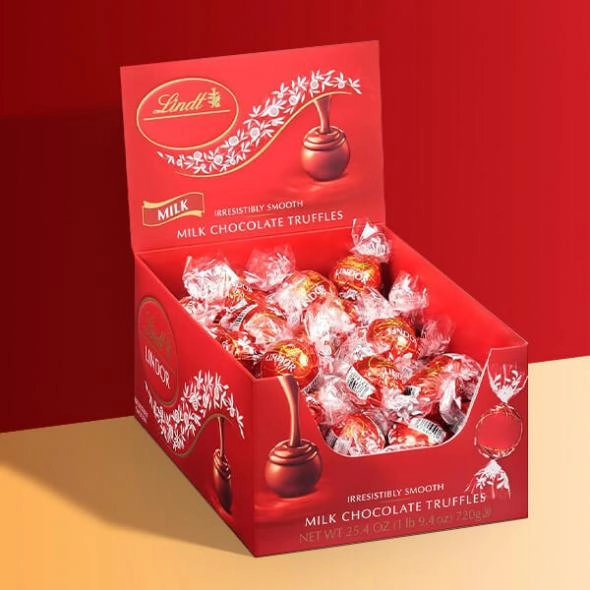
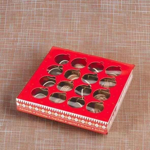
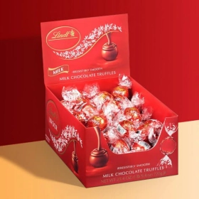
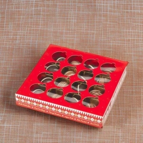
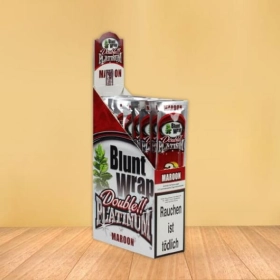
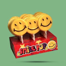
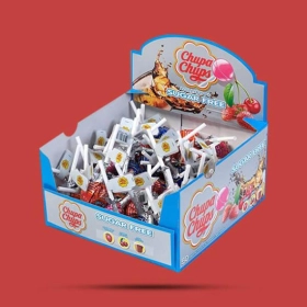
Chocolate Display Boxes are an exciting way to bring colour and fun to any space. With the right combination of colours, they can draw attention and create an eye-catching display. In this blog post, we'll explore how to choose colours for your Chocolate Display Boxes that will make them stand out. From bold primary colours to subtle pastels, we'll show you how to choose the perfect colour combinations for your Chocolate Display Boxes.
Why Color Combination Matters in Chocolate Display Boxes
Colour is an essential aspect of any design, which also holds for Custom Chocolate Display Boxes. The right colour combination can make all the difference in catching the eye of potential customers and conveying your brand's message.
Regarding Chocolate Display Boxes Wholesale, color is crucial in attracting attention and standing out from the competition. Bold and vibrant colors like red and yellow can create a sense of excitement and urgency, while soft pastel shades like pink and lavender can evoke a feeling of elegance and luxury. The colors you choose can evoke emotions and create a visual impact that draws customers in.
Color theory is important to consider when designing your Chocolate Display Packaging. Understanding how different colors interact can help create a harmonious and visually appealing color palette. For example, complementary colors, which are opposite each other on the color wheel, can create a striking contrast that grabs attention.
Using contrasting colors is another effective way to highlight your brand's message on cake bikes boxes. By placing colors opposite each other on the color wheel, such as blue and orange or purple and yellow, you can create a visually striking contrast that draws attention to specific elements or text on the packaging.
Understanding Color Theory for Chocolates
Understanding color theory is crucial when designing your Custom Chocolate Display Boxes. The colors you choose for your Chocolate Display Boxes Wholesale can significantly impact how customers perceive your product.
Additionally, understanding complementary colors can be beneficial in creating a striking contrast. Complementary colors are opposite each other on the color wheel and when paired together, they create a visually pleasing contrast that grabs attention. For instance, combining blue and orange or purple and yellow can create an eye-catching display on your Chocolate Packaging.
By understanding color theory and applying it to your Chocolate Display Boxes, you can create a visually appealing and attention-grabbing product.
Tips for Creating an Eye-Catching Color Palette for Your Chocolate Packaging
First, consider your target audience and the message you want to convey with your Chocolate Display Boxes Wholesale. Are you targeting a young and trendy crowd, or perhaps a more sophisticated and elegant market? This will help guide your color choices and ensure they resonate with your intended customers.
Next, think about the overall theme or concept for your Chocolate Display Packaging. Are you going for a vibrant and playful look, or a more minimal and sleek design? This will determine the intensity and saturation of the colors you choose.
Feel free to experiment with different color combinations. Consider using a color wheel to find complementary or analogous colors that work well together. This will create a harmonious and visually appealing palette for your Chocolate Packaging.
Remember, balance is key. Too many colors can be overwhelming, so stick to a cohesive color scheme that reflects your brand's identity and conveys the desired message. Incorporate pops of bold colors to catch the eye, but also include more neutral tones to create balance and sophistication.
Following these tips, you can create an eye-catching and visually appealing color palette for your Chocolate. So go ahead and get creative with colors and let your chocolates shine!
Top Color Combinations to Consider for Your Chocolate Display Boxes
When creating eye-catching Chocolate Display Boxes, the right color combinations can make all the difference. Here are some top color combinations for your Chocolate Display Boxes that will catch the eye and leave a lasting impression.
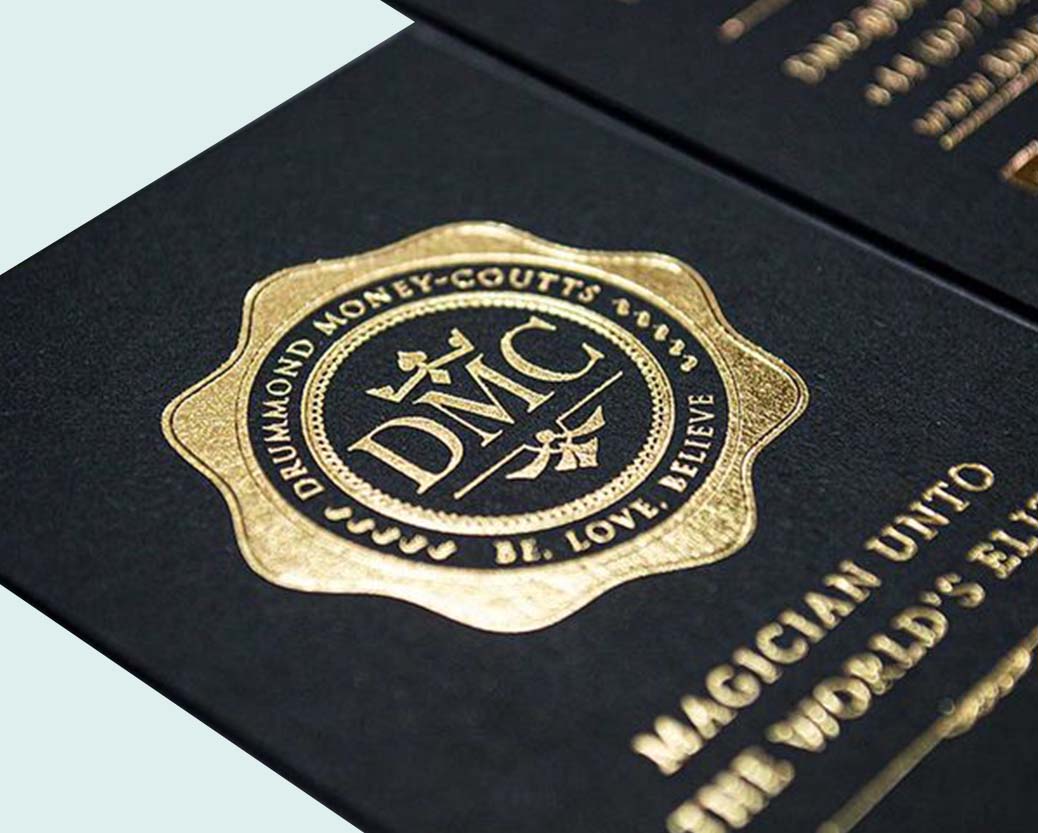
1. Classic and Elegant: Opt for a timeless combination of black and gold. This sophisticated duo adds a touch of luxury and elegance to your Chocolate Display Boxes. The deep black and shimmering gold contrast creates a striking and memorable look.
2. Playful and Vibrant: Inject some fun and energy into your Chocolate Display Boxes with a combination of bright and bold colors. Think vibrant blues and oranges, or sunny yellows and greens. These lively color combinations are sure to draw attention and create a sense of excitement.
3. Soft and Romantic: Consider combining pastel shades such as blush pink and soft lavender for a more delicate and romantic look. This subtle and dreamy combination creates a sense of elegance and beauty, perfect for showcasing luxury chocolates.
Using Contrasting Colors to Highlight Your Brand's Message
Using contrasting colors is a powerful tool to highlight your brand's message on your Chocolate Display Boxes. By strategically placing colors opposite each other on the color wheel, you can create a visually striking contrast that draws attention to specific elements or text on the packaging.
Contrasting colors also help create visual hierarchy on your Chocolate Packaging. By using a contrasting color for your brand name or logo and a more subtle color for the product description or additional details, you guide the viewer's eye and direct their focus to the most important elements. This ensures that your brand's message is easily understood and remembered.
When designing your Chocolate Packaging, a cohesive color scheme is essential. The colors you choose can make all the difference in catching the eye of potential customers and effectively communicating your brand's message.
Furthermore, a cohesive color scheme helps to create a sense of recognition and brand identity. Consistency in colors across different products or packaging variations helps customers easily associate those colors with your brand. This can lead to increased brand recall and loyalty.


Jacky Chan
Since 2012
Thank you very fast shipping from Poland only 3days.
December 4, 2020 at 3:12 pm
ReplyAna Rosie
Since 2008
Great low price and works well.
December 4, 2020 at 3:12 pm
ReplySteven Keny
Since 2010
Authentic and Beautiful, Love these way more than ever expected They are Great earphones
December 4, 2020 at 3:12 pm
Reply